Towards A Science-backed Visualization
Is the human brain hard-wired to perceive some visual channels better than others?
A single dataset can be visualized by different plots, a set of visualizations that can be called a feasible design/visual space. All these plots are technically correct, but are they equally effective in communication with the audience?
Let’s clarify the point through an example. Assume that the following dataset is the frequency table of users of the standard analytical tools at the Bank.
| tool | user_count |
|---|---|
| Rstats | 500 |
| Python | 300 |
| Tableau | 310 |
| Matlab | 50 |
| Stata | 45 |
This dataset of two variables, one categorical and one numerical, can be visualized in several valid formats, some of them presented as follows:
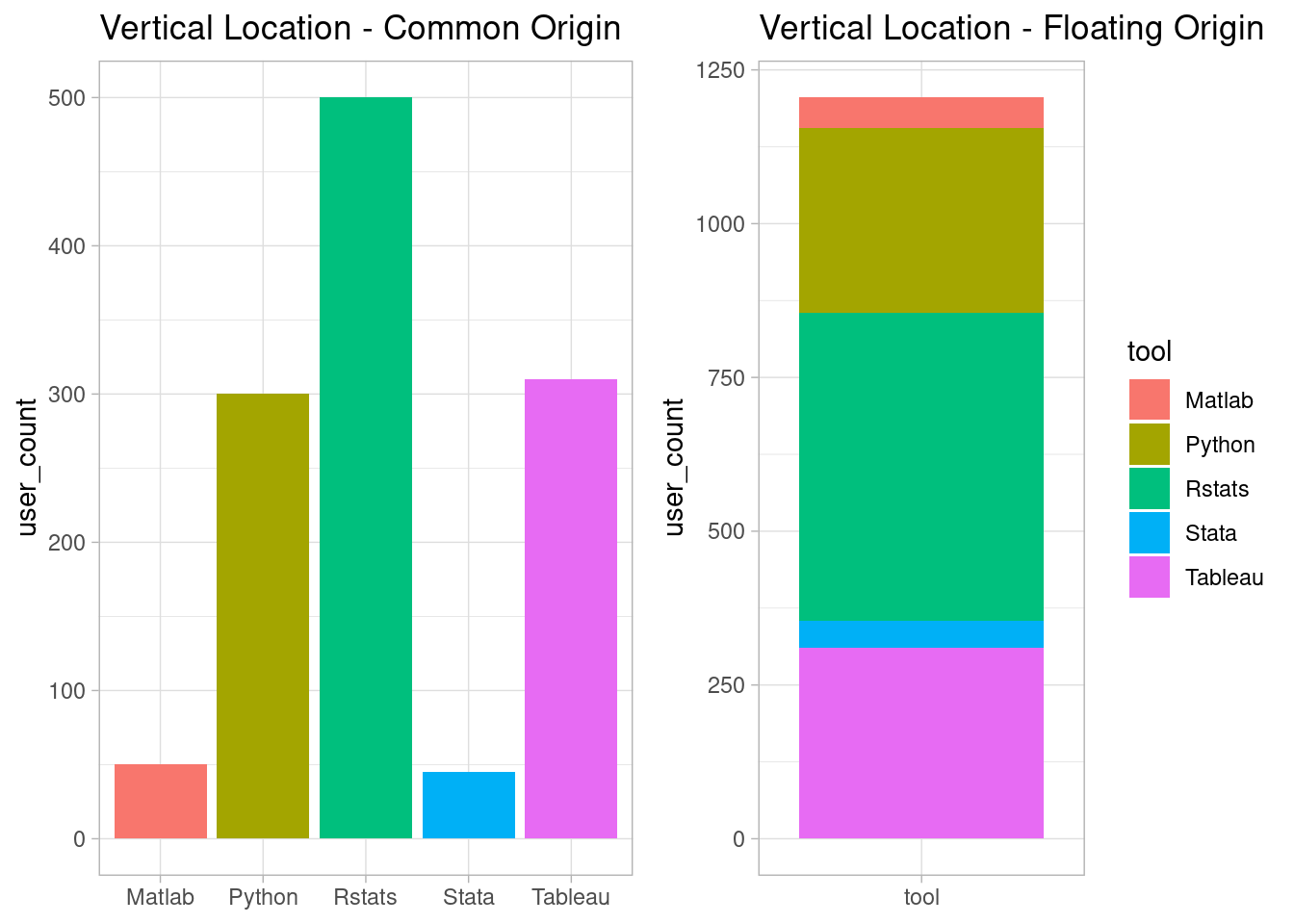
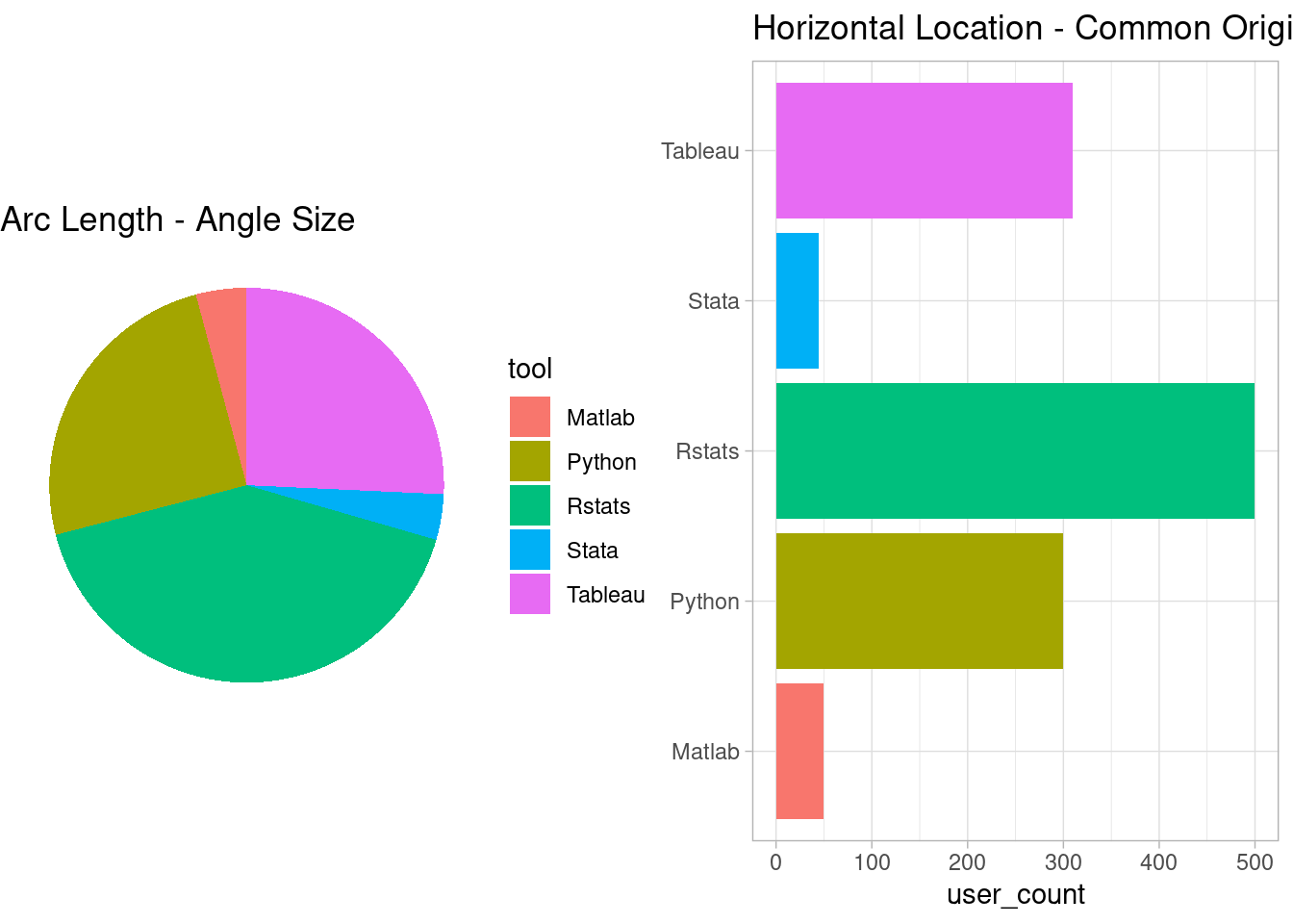
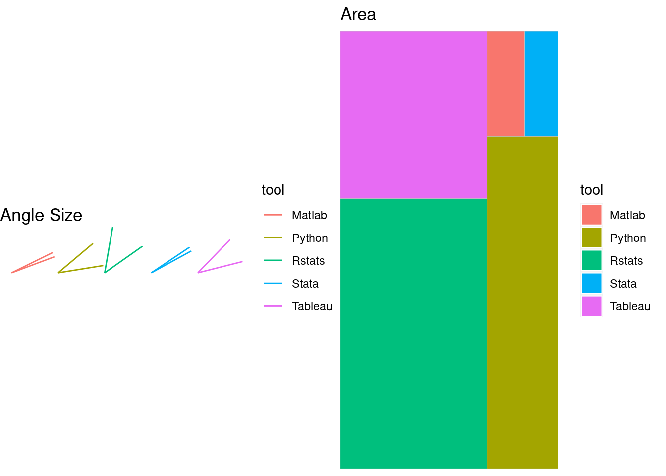

The above plots are designed to emphasize different visual channels, such as location/position, length, area, angle, and shade. All these plots are valid visualizations of table 1. Now the question is, which one of these plots better communicates the dataset? Is there any method to objectively rank these visual channels based on their effectiveness? Is the human brain hard-wired to perceive any of these visual channels more accurately than others?
It is known that Cleveland and McGill (1984) are the first scholars who tried to answer these questions using the scientific approach in their seminal paper, titled: Graphical perception: Theory, experimentation, and application to the development of graphical methods
This article tends to review that seminal paper very briefly, not only because it has a tremendous historical value but also because the question is still relevant: how to choose a plot from the feasible design space of a dataset? A question that is disregarded in data analytics books and modules to the best of my experience1. The reason behind such disinterest might be the belief that an intuitive approach to information visualization suffices, as was the case at the time of the publication of the paper:
American national standards Institute 1979 provides guidelines for making graphs, but the manual admits “this standard…sets forth the best current usage, and offers standards by”general agreement” rather than “by scientific test.”(Cleveland and McGill 1984)
Still, graph design for data analysis and presentation is largely unscientific. This is why Cox(1978) argued “there is a major need for a theory of graphical methods” and Kruskal(1975) stated “in choosing, constructing, and comparing graphical methods we have little to go on but intuition, rule of thumb, and a kind of master-to-apprentice passing along of information… there is neither theory nor systematic body of experiments as a guide.”(Cleveland and McGill 1984)
Hence, the authors decided to study the ability of the human brain to perceive different visualizations of a common dataset, and figure out whether there are natural preferences among length, position, and angle.
They used the following plots in their lab, and asked two questions from ~50 participants in the experimentation:
- Which one of the marked segments is the largest?
- What percentage of the larger segment is the smaller one?
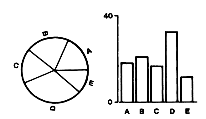
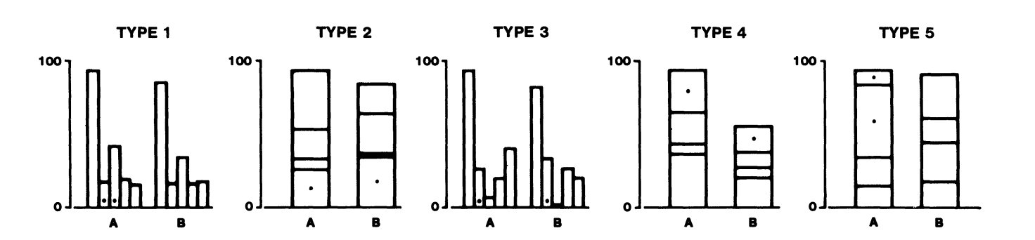
Through these questions, they intended to measure the quantitative extraction accuracy of different visual judgments, i.e. decoding accuracy of visual channels, over these elementary perceptual tasks.
Having shown the plots to the participants, the authors recorded the participants’ answers to calculate the perceptual error, a function of the difference between the actual and perceived proportion size of the small segment over the large part. For instance, for a participant who perceived proportion of slice A to slice B in a pie chart 15%, while the actual proportion is 10%, the error would be a logarithmic function of 15%-10% = 5%.
If all these visual channels are perceived identically, then there shouldn’t be any significant difference between the corresponding perception error distributions. On the other hand, if there was a significant difference between the accuracy of information extraction from the different visual channels, then the authors had taken the first step towards a scientific theory of data visualization.
The mean recorded errors for each plot and their 95% intervals were as follows:
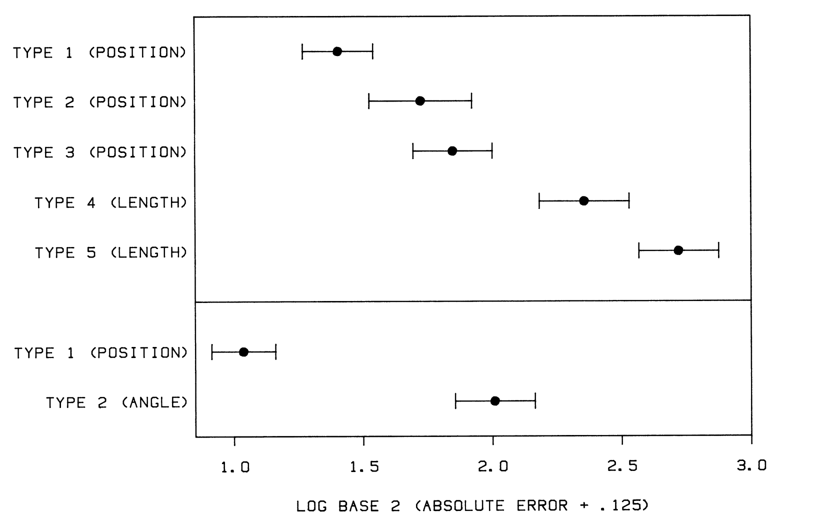
They found the first evidence of how our brains work in the perception of data visualization. According to their findings, position was a significantly better visual channel than angle, and position is also a better visual channel than length.
Nevertheless, they were humble and realistic about their scientific advancement:
We expect that our theory, like all theories, will undergo much revision as new experimental information is accumulated.
And knew that judgment accuracy is only one of the factors in choosing a plot’s components:
the ordering of the perceptual tasks does not provide a complete prescription for how to make a graph. Rather, it provides a set of guidelines that must be used with judgment in designing a graph. Many other factors […] must be taken into account in the design of a graph.
And they asked the community to be open to change:
If progress is to be made in graphics, we must be prepared to set aside old procedures when better ones are developed, just as is done in other areas of science.
Since then, many studies have been published on the topic; their main differences lie in using different criteria of the graphical perception, extended list of visual channels, and other means of experimentation, e.g. using a crowdsourcing platform than a physical lab.
For example, (Heer and Bostock 2010) replicated and expanded the (Cleveland and McGill 1984) using Amazon Mechanical Turk, and presented an updated ranking table of the visual channels’ effectiveness based on the same decoding accuracy criterion. Their findings were represented in a more visually appealing way by (Munzner 2014, 105)

According to this ranking, the most effective visual channel is the position with a common scale(origin) in a single barplot, and the 2nd effective channel is the position with a common scale(origin) in two separate stacked-barplots. On the other hand, the least effective channel is the rectangular area without any common scale.
In the next post, I will review a relatively recent paper(Bertini, Correll, and Franconeri 2020) that looks at graphical perception studies from a critical perspective. However, it is fascinating to know your opinions about this ranking before doing so. What do you think about it? Should we strictly follow it? Should we consider other criteria besides accuracy? If yes, then which criteria? Should we consider our audience in the design choice? What about measuring the effectiveness of the plots we generate for the public?
Your ideas are precious.
PS. I am Shahin Ashkiani, the new learning lead of the Skills and Culture hub, mainly responsible for the R courses. I try to publish similar blogposts weekly or biweekly, depending on the workload. The new courses, and the revision of the current ones would cover some of these academic findings.
References
Footnotes
For instance, you can hardly find any relevant section in books that are designed for making sense of the data, such as (Myatt 2007) or (Provost and Fawcett 2013). However, some books, such as (Mount and Zumel 2019), have allusions to the fact that some plots are easier-to-read than others in a minimal fashion.↩︎